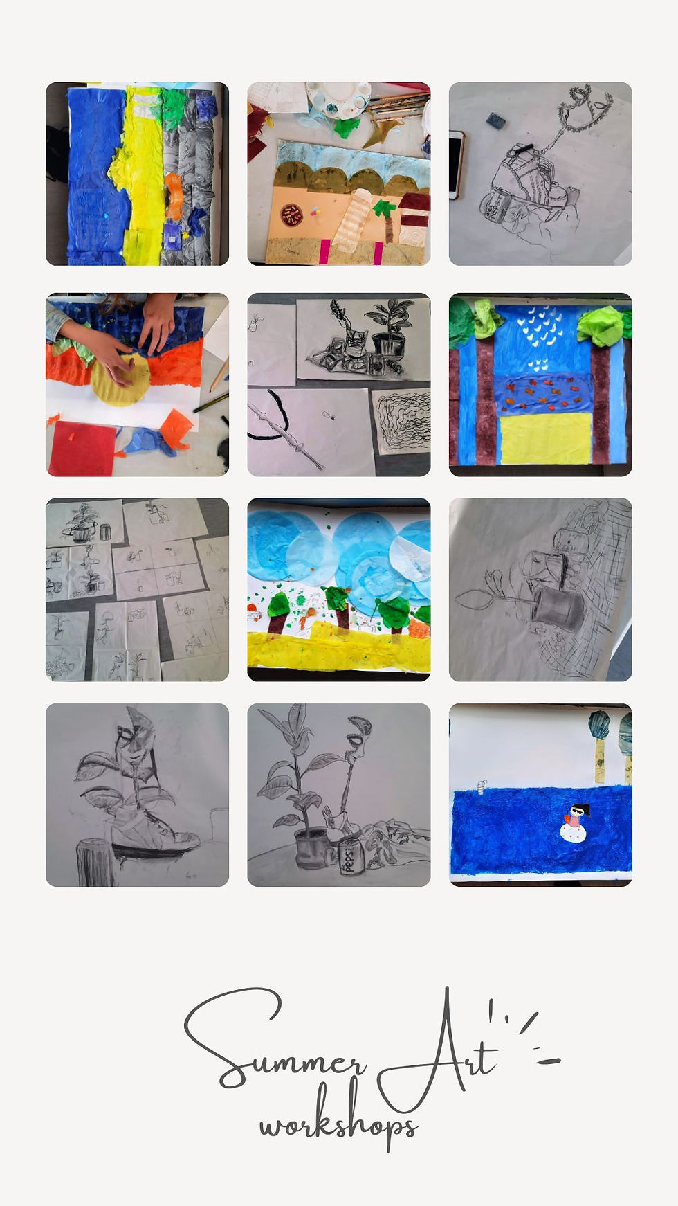
Painting imaginary landscape
- artworksmonika

- Apr 11, 2020
- 4 min read
Continuing our mini #lessons in #art, today we will create a landscape. The current situation only allows us to go out when absolutely necessary, and even then only as little as possible, so I thought why not paint the place where we would like to go when this is all over. And so today we will work from our #imagination.

As Einstein once said: imagination is more important than knowledge.
The fact is, majority of the famous artists you’ve heard of painted from their imagination and memories. Just look at most of the 20th century art, for example the works of Picasso, Chagall or Dali. By the way, the Starry Night isn’t a real place either. And although the Impressionists loved to paint on locations, before them, prior to the mid-19th century, artists did not have access to paints in tubes (or photographs). They had to rely on their sketches and memories (or make it up completely).
But enough of art history. Bottom line is, imagination IS important for the development of creativity- in any aspect of life. So, let’s get straight to it.
First thing first, let’s start by identifying what kind of landscape you would like to paint, what will it consist of- a park, a hillside, seaside, mountains, city, or a little cottage in flowery field… the choice is yours.
Remember, in art there is no right or wrong. At the end of the day your work is unique to you. So if you skip or change one of the steps below (accidentally or deliberately) you can still create a wonderful piece of art.
1. Start with light: pale blue, or possibly yellow- these are the colours found in nature and therefore they are the best choice for your background colour (note: the blue is probably a safer choice and will look more natural, but the yellow will make your finished painting look “happier”)
2. Identify your perspective (skip this point if you do not want your work to have 3rd dimension, which is completely acceptable in modern art!)- this would be a point on your canvas or paper that gives the painting it's depth. In other words, when painting a landscape of any kind perspective is where all the lines are heading- somewhere in the "back". Try not to put this perspective point directly in the middle. Mark it down with a small dot, or maybe few short lines as described in the next step.
3. Work from light to dark- once you have your background “prepped”, start adding in lines, first finer and shorter ones near your perspective point (if you have one), and as you move away from it your lines should start to become broader and longer. These lines we are adding in now are the basic forms of all the objects the painting will have, so choose a colour that is not too strong against the background- for example a darker shade of the one you just used. That way if you decide you don’t like a certain item in the painting, you can easily get rid of it by either blending it into the background or painting over it with another colour.
4. Define the composition- now that we have the background and the basic composition, it is time to start defining each item with more precision. Once again, we need to start with the background items- those that should appear the furthest away should look hazier, almost as if disappearing, so there is very little we need to do with those lines (unless you wish to add another layer perhaps). As we move towards the front of the painting (the foreground) our objects need to become more and more visible, with the strongest and most precise ones being at the very front. This is where we start adding not only stronger lines, but also new colours (note: only use black if your composition has something man made in it, or if you are painting is a specific artistic style…or you are short of art supplies like myself and have a limited colour choice). One trick I use in most of my paintings is that I reserve one colour that I use specifically to add highlights. This is something like a finishing touch, and if you do decide to use this trick be aware that since this one colour is used only in that one place, it will be the first thing people will notice- so make it worth!
Let’s have a look at my two examples below. Both of these were painted without any photo reference. That is not to say you cannot look at any pictures for inspiration, only that you shouldn’t try to copy the photographs, but rather let your imagination alter the reality.

In the first painting I did, I decided to start with a dark background- which you can do as well, if you have access to acrylic colours, or want to use collage later.
Whilst the next painting is completely made up, this example is based on memories, altered to fit my painting.

In the second painting I skipped the background completely and started by making very light (and very random at this point...) lines.
In spite of turning it into a tropical nature setting later, I did not use any green (because I ran out of yellow to mix into my blue, and I do not really have any green). This is just to show that your colours are your own choice
I chose these examples so that you can see the steps are a guide to help out, but can be amended. These are not strict rules. As I said before, in art you can't make mistakes.
As mentioned, neither one of these was painted using a reference photo, which is important as painting from imagination gives you the freedom to experiment and improvise, and so create your own reality- which is something we all need a little bit of right now.
Here are the finished paintings.


I hope you enjoyed this little challenge and I'm looking forward to seeing your creations. Should you get stuck I’m always happy to help, let me know either in the comments below or via direct email.
Stay safe and stay creative.


Comments