How to create a cityscape in mixed media
- artworksmonika

- Mar 25, 2020
- 4 min read
Updated: Apr 10, 2020
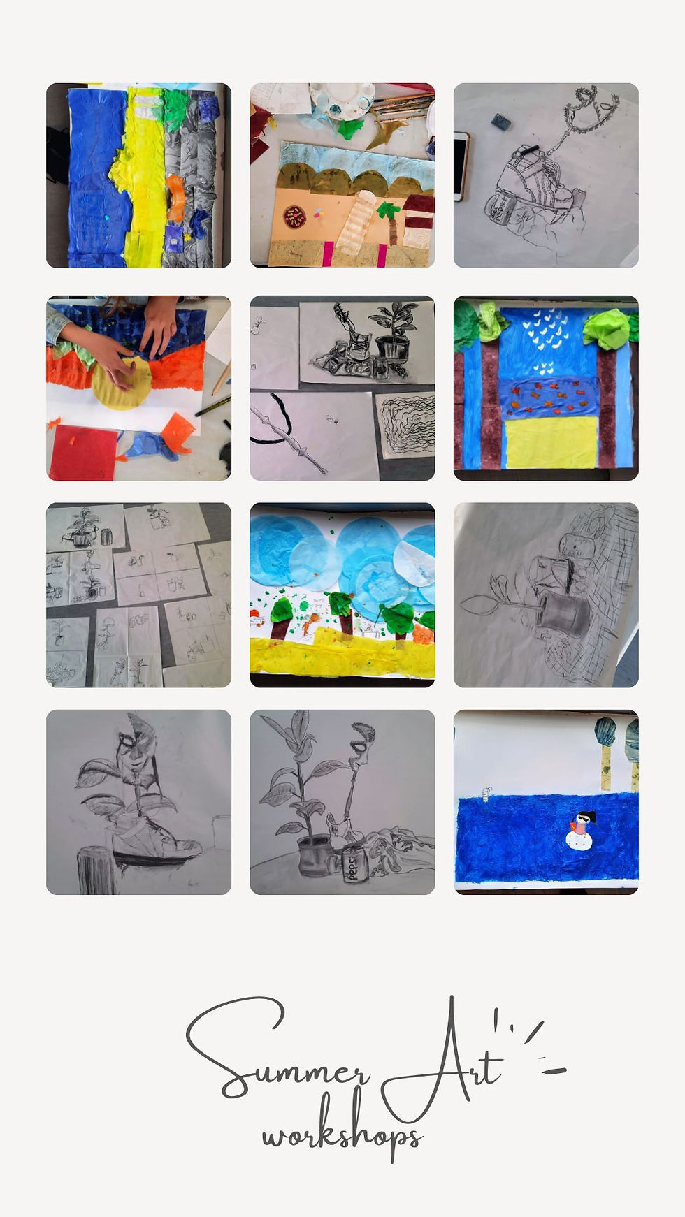
I thought since lots of us are at home looking for some new things to do, I’d do a few #free mini art #lessons. Just some tips and techniques you can try if you want to be more #creative.
In this first mini lesson, I’m going to explain how I create a mixed media cityscape. For this I’ll be using acrylics, ink, collage, some pastels (maybe) and then finally oils (because I love them!).
The first step, when starting any art project, is: Begin with an end in mind (Phrase taken from Stephen R. Covey’s book: The seven habits of highly effective people- subject that applies here just as much as to any other aspect of life). This means you’ll need to have a clear vision of what it is you want to paint and what you would like the finished project to look like. And the best way to achieve this vision is to sketch it. Your sketch can be as messy or as neat as you like, and you can do as many as you like as long as the one you decide to work from has two things that you are happy with:
Composition
Colour scheme
(here is my chosen sketch)

Once you know what colours you want to use and how you want to compose your subject, you can start building your artwork. Generally, when painting there are few rules that should be bared in mind (and yes, rules are meant to be broken… but only for the sake of progress. So, if you are not sure what you’re doing, just follow the rules for now)
Start with lighter colours, adding darker ones later.
Paint the background first
Now these two might clash if you are painting/ drawing a light subject on a dark background, but there is a trick or two to that too, depending on what medium you work with. If that’s the case, just drop a comment below and I’ll try to help.
Since I’ll be working with mixed media, I need to bare in mind which medium works well with which. For example, you can put pretty much anything on top of acrylics, but you can not put acrylic on top of oil-based colour. Needless to say, once you have an oily base and want to add a collage, it will be very difficult to make it stick. So I start with a light blue acrylic sky.
I like my paintings to be expressive and so I keep the brush-strokes visible. If you do this (or maybe decide to add clouds) you can use the sky to create perspective and lead the viewer’s eye to a specific point in the painting. (quick note: try not to place this point of interest right in the middle of your canvas or paper. Your work will be much more exciting if you place it just off-centre)
Next step is to paint in the composition of the subject. In my case it is the skyline of the city, which I decided to do as a collage.

Once my composition is done, I start to add highlights with a black ink, and few light and dark marks with pastels. I generally try to stick to the same shades of a colour across all the mediums, because using too many shades of one colour can make your painting look messy in some cases.

Now it’s time to move to the foreground of the painting- in my case some trees. First I use a large brush to fill in all the white space with colour.

Once I have all the elements in the painting, I start to add new layers, this time with oil colours, and again starting from the background. The advantage of another layer means you can repaint marks you didn’t quite like in the first layer or highlight those you think make good impact. Just try not to paint over your composition too much (little is OK, little can be fixed later). When painting the sky, especially clear one, it is best to keep lower parts lighter and the higher parts darker/ bluer. For a new layer on the foreground, I use a palette knife.
I try to make the foreground more exciting by adding some highlights to it. Since my foreground is a park, I paint in lines to give the idea of tree branches. You can see in the video below I don’t mix my colours on the palette, but rather apply clean colours on the surface and let them mix as they overlap. To create an impression of trees I dab the palette knife on the surface, instead of spreading the colour.


At this stage your artwork is developing by adding new layers. As I mentioned before, this helps you add more depth and define parts you like or get rid of those you think don’t work. And so I go back to the buildings and add more yellow highlights and dark grey shadows. Since at the moment I don’t like the look of the sky, I’m going to add another layer, but this time with a palette knife to create a bit of drama.
One final touch is to add more black to the buildings to make my subject stand out from the rest of the painting- but this is something that is optional and very much depends on your personal style.
Thank you for reading, and hope you learnt a trick or two in this mini lesson. If you give it a try, do let me know how it went 😊 Feel free to comment below with any questions, any tips you’d like to share, or even suggestions for future topics.


Comments